A Comprehensive Checklist to Optimize Your eCommerce Product Page
Intro
Looking to optimize your eCommerce product page for better conversions? Check this out! While some of these implementations may require the help of plugins or apps, this checklist serves as a great starting point for any business looking to improve their conversion rate optimization (CRO) efforts. Keep in mind that this is a shortened version of a longer checklist, but it provides a strong foundation to build upon. Contact me further for implementing these steps and see the before and after results at the bottom of the page.
The Checklist
Product overview (above the CTA area)
| ☐ Product titles are descriptive |
| ☐ The main product title is visually prominent compared to other content |
| ☐ The product title is under 65 characters so it appears fully in Google search results |
| ☐ The product subtitle highlight key product benefit and contain power words, e.g. effortless, incredible, absolute, unique, secret, now, new, exclusive, how to, why |
| ☐ Product rating overviews are shown near product titles |
| ☐ A short list of other key benefits or keywords of the product is near the main title |
Image gallery
| ☐ The main product photo is attractive |
| ☐ The main product photo allows a user to zoom in easily (especially on mobile) |
| ☐ There is a gallery with different product photos |
| ☐ The product gallery shows thumbnails of other available images |
| ☐ The product gallery contains product videos |
| ☐ The product gallery contains arrows to navigate between images |
| ☐ The product gallery supports swipe actions on mobile devices |
| ☐ There are images for different product variants/sizes |
General
| ☐ Sticky navigation with product name, product image, product page sections, availability, old price, new price, discount and CTA that hides when the user is scrolling down but reappears when the user scrolls up |
| ☐ Product page has an option for potential customers to ask questions (e.g. live chat, phone number) |
| ☐ Product page contains breadcrumbs (not applicable to all pages) |
| ☐ A customer can give their email address if the product is currently not available; they will be notified when it becomes available |
| ☐ Clicking the back button always takes the user back to the page the user came from |
CTA
| ☐ The main CTA is the most visible element on the product page and contains the “cart” icon |
| ☐ Product variants are easily accessible on mobile and big enough with enough white space around to prevent misclicks |
| ☐ The product variant selection is connected with the product gallery and shows images of chosen product variants |
| ☐ A visible reminder is included to select size/color if a customer forgets and clicks “add to cart” too early |
| ☐ Interactive selectors are used for product variants (the gallery image and the price are changed in real-time, without triggering a page reload) |
| ☐ A size chart (or link that opens in a small popup and is easily closed on mobile) is provided near the size selections (for products with different sizes) |
| ☐ Localized units for products are shown with different sizes/measurements (e.g. cm, inches, kg) |
| ☐ Product descriptions mention the size of the model and the size of the shirt the model is wearing (only for apparel) |
| ☐ Interactive selectors are used for quantity selection instead of dropdowns (the price and quantity are changed in real-time, without triggering a page reload) |
| ☐ The CTA copy clearly explains what will happen when you click on it (e.g. Proceed to secure checkout) |
| ☐ Clear feedback is provided once the product has been added to the cart (e.g. a number in the mini-cart widget increases) |
| ☐ The main CTA change states once users add a product to the cart (e.g. “[check arrow] Product added to your cart” and after 2 seconds “Go to my shopping cart [right arrow]”) |
| ☐ The price of the product is prominent enough, especially if it’s discounted |
| ☐ The price of the product is placed near the main CTA |
| ☐ The price of the product is localized |
| ☐ The background color of the product’s primary CTA differs from other elements (e.g. slightly grey) |
| ☐ All additional charges that may apply are shown near the main CTA (e.g. additional shipping costs due to product size, VAT) |
| ☐ If free shipping is offered, it’s highlighted near the main CTA |
| ☐ All shipping information is shown near the main CTA (delivery to shopper’s location, shopper’s country flag, cost, time) |
| ☐ Availability of the product is shown near the main CTA (e.g. “In stock”) |
| ☐ The old price (with a strike-trough) is shown with the new price and how much shoppers will save (% or $) when the product is on sale |
| ☐ Clear information is shown about returns, refunds and money-back guarantee |
| ☐ Express payment options are shown and available that are commonly used (e.g. PayPal, Amazon, Google Pay, Apple Pay). Useful for direct-response landing pages |
| ☐ There is an option for a payment with installments (if possible) |
Social Proof
| ☐ Product page highlights logos of news sites/blogs/celebrities where the product/brand has had PR exposure (e.g. “Used by executives at Fortune 500” ) |
| ☐ Customer reviews are shown with a review title, customer photos of product, star rating, photo of reviewer, name and last name, “verified” buyer, occupation, and age |
| ☐ Customer reviews visually stand out from other content (ideally on a slightly yellow background) |
| ☐ Product page contains photos (with faces) of how (happy) customers are using the product |
| ☐ Product overall star ratings are shown and can be filtered by the star rating |
| ☐ Product page contains the number of customers this week/month/all-time (e.g. “19,222 products successfully shipped and delivered this month alone”) |
| ☐ Product page contains video testimonials |
| ☐ Product page contains the number of Facebook and Twitter followers |
This is a condensed version of a much larger checklist that covers optimization for various pages such as the homepage, product page, shopping cart, and more. If you’re interested in implementing some of these solutions for your eCommerce site, don’t hesitate to contact me. In the meantime, take a look at some of the stores below to see how similar CRO techniques have been applied.

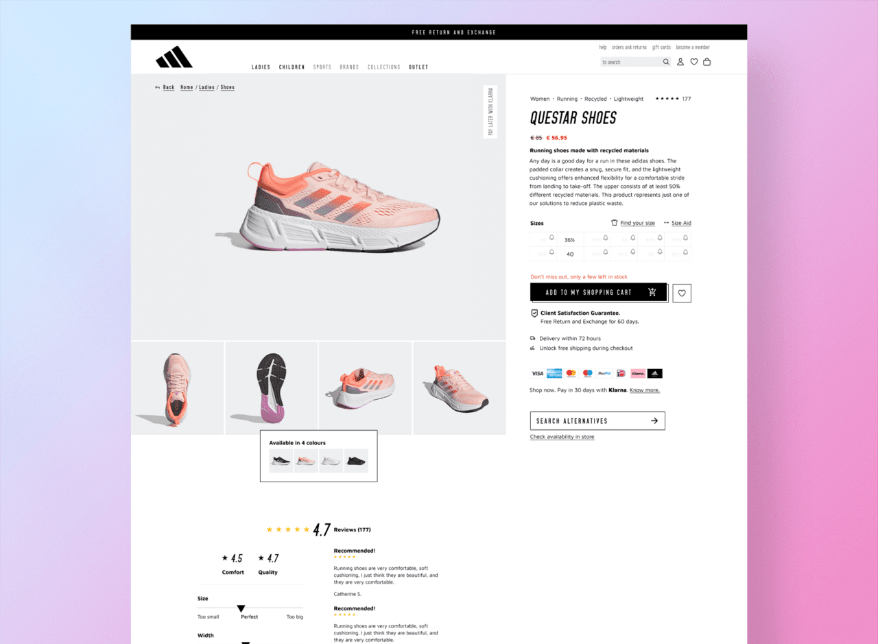
As you can see from the image above, this product page incorporates several CRO ideas discussed earlier, including highlighted information, a clear description, and product reviews.
"Anna has a sharp perception and can spot problems before they arise. She's highly skilled in strategizing, analyzing and keeping an overview of a project or team. She is very sensitive & sensible in using proper communication lines, and can adapt easily in various roles, depending on the needs of team members. She is a natural leader, a proactive team member and a highly accountable colleague. Anna has the knack for understanding what is needed in order to get a desired outcome and how to support and motivate the team to reach success."